the Baking Room Rebrand
The Baking Room, a beloved community bakery known for its artisanal bread, was preparing to open its first permanent location and sought to refresh its brand identity to reflect this new chapter. The goal was to create a cohesive, modern identity that would resonate with both new and existing customers, emphasizing the bakery's commitment to authenticity, community, and craftsmanship.


Project Scope
The rebranding project for The Baking Room encompassed several key components:
Brand Strategy Development: Refining the brand’s mission, vision, and tone of voice to align with its growth and future aspirations.
Visual Identity System: Designing a new logo, color palette, typography, and imagery guidelines to create a consistent and recognizable brand presence.
Brand Application: Implementing the new identity across various touchpoints, including packaging, in-store design, digital platforms, and marketing materials.
Brand Strategy
The Baking Room’s rebranding strategy was built around three core pillars: authenticity, community, and craftsmanship. These pillars guided every aspect of the brand’s communication and design:
Authenticity: The brand messaging highlights the purity of ingredients and traditional methods, ensuring transparency and distinguishing The Baking Room from mass-market alternatives.
Community: The Baking Room is positioned as a community hub, fostering connections through events, workshops, and partnerships. The brand emphasizes active engagement with its audience via social media and newsletters.
Craftsmanship: The brand celebrates the skilled labor and time invested in each product, with a visual identity that reflects artisanal quality through natural textures and handcrafted aesthetics.
Logo: The new logo is a versatile and meaningful emblem that conveys the bakery's commitment to quality and community. Its design, reminiscent of bread loaves, uses a color palette inspired by natural ingredients and the golden hues of freshly baked bread.
Typography: Avenir Next was chosen as the primary typeface for its clean, modern lines that marry contemporary style with functional elegance. The diverse weights of Avenir Next allow for clear hierarchy in communication, whether in digital or print media.
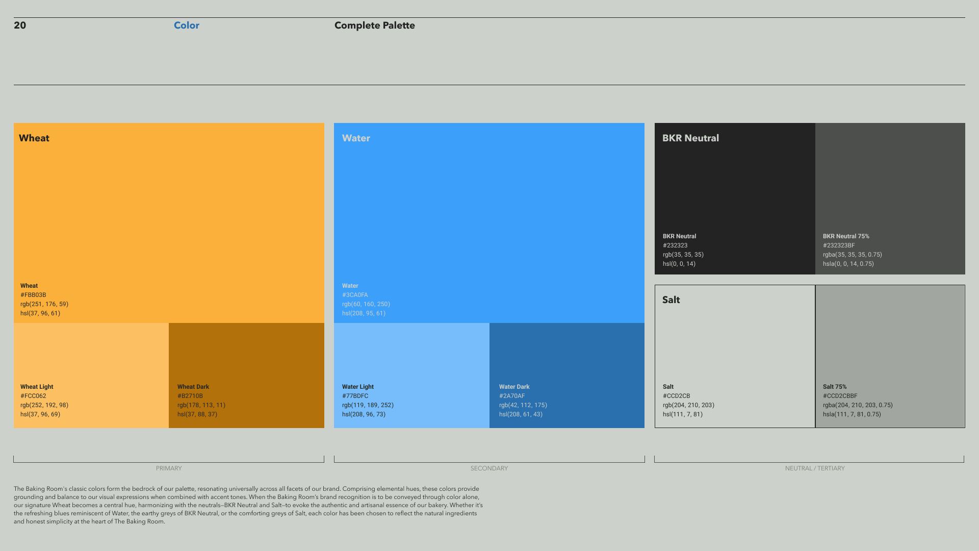
Color Palette: The color palette reflects the natural ingredients used in the bakery, with warm amber and rich wheat hues symbolizing the golden crust of bread. Soft beiges and creamy off-whites provide a foundation of simplicity and authenticity, while pops of savory olive and herbaceous green add vibrancy and freshness.
Imagery: The imagery focuses on the authenticity of the bread-making process, showcasing hands-on techniques, rustic loaves, and the warmth of the ovens. The visuals connect customers to the true experience of artisan baking, emphasizing the dedication and craft behind each product.
Graphics: Elements derived from the logo, such as the grain pattern, are used to establish a distinctive visual language. This pattern is applied across various materials, reinforcing the narrative of care, quality, and authenticity.
Visual Identity System
The visual identity system was designed to be both adaptable and evocative, capturing the essence of The Baking Room’s brand values.


